Dairy Farmers of Canada reveals new logo

Nov 02, 2016

Organization hopes new logo will help relationship between farmers and consumers

By Diego Flammini
Assistant Editor, North American Content
Farms.com

Dairy Farmers of Canada unveiled a new organizational logo on Nov. 1 as a way to show its progression as an organization, and the progression of the dairy industry as a whole since the organization’s beginnings in 1934.

"It is exciting for our organization to move into a new era, and vitally important that we continue to evolve as an organization within an innovative and dynamic sector,” Caroline Emond, executive director, DFC, said in a release. “Today we highlight and celebrate the hard work of our dairy farmers, as well as their great contribution to the overall physical, emotional and economic health of Canadians.”


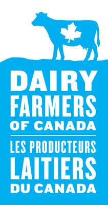
The new logo features a standing cow, in DFC’s signature blue, wearing a white maple leaf on its body. The words “Dairy Farmers of Canada” appear underneath in French and English.

The box on which the cow stands represents different kinds of farm ground and bedding, to give consumers a sense of an honest product.

"Dairy farmers are innovators and are always looking for ways to improve and evolve," said Wally Smith, DFC president, in a statement. "Today's announcement reflects this as we are looking to the future, for the industry and for consumers, to truly differentiate the Canadian dairy sector.”


DFC also unveiled a Certification of Origin logo. In addition to the blue cow with white maple leaf and the words “Dairy Farmers of Canada” underneath, the words “QUALITY MILK” are present to show consumers the products are made with Canadian dairy.

Subscribe to our Newsletters

Trending Video


Comments


Your email address will not be published