Sampling saves time and money
Measuring all the apples on a tree to determine the average fruit size or measuring all the shoots on a tree to determine average shoot length or counting all the flowers on a tree to determine return bloom is very expensive and not realistic. Although the most reliable data are obtained by measuring every fruit or every shoot on a tree, a reasonable estimate can be obtained by measuring some of the fruit or some of the shoots. This is called “sampling” or “sub-sampling.” The more measurements we make, the closer will be our estimate to the true value. From my experience, measuring at least 20% of the fruit on a tree and about 10% of the shoots on a tree will provide a pretty good estimate of the true average value.
In the case where we simply want to know if there is a relationship between two variables, or if two variables are correlated, we may not have treatments. For example, we may want to know if fruit background color measured with a DA meter is related to starch index for predicting fruit maturity, or we may want to know if average fruit diameter is related to the number of fruit on a tree, or we may want to know if growth of young trees is related to the soil pH around the tree. In this case, with no treatments, we can simply plot the value of one variable (fruit diameter, DA meter value, or tree height) against the other variable (starch index, number of fruit per tree, or soil pH). With Excel software we can easily obtain a best-fit line that will show us the slope of the line.
Example of correlation
This summer I wanted to predict apple fruit diameter at harvest from apple diameter measured 60 days after bloom (DAB). I selected 10 representative trees and tagged 10 fruit on each tree. At 60 DAB I measured each fruit with calipers. At harvest time, I again measured each fruit. I entered the values into an Excel spread sheet with one column for fruit diameter 60 DAB and the other column had the diameter of the same fruit at harvest. Table 1 shows an Excel spread sheet with fruit diameters (mm) for five fruit. Column A contains values for fruit diameter at 60 DAB and I called it “diam1”. Column B has diameter values for the same five fruit measured at harvest and I called it “diam2”. A scatter plot of the data can be produced in Excel by highlighting both columns of numbers. Then go to the top of the spreadsheet and click on the “insert” button and then click on the scatter tab. In the drop down menu click on the upper left plot that shows a scatter plot with only markers. You will see a scatter plot of the data and you should be able to tell if there is a pretty good relationship between fruit diameter at 60 DAB and fruit diameter at harvest.
Table 1. Fruit diameter data for 5 fruit in an Excel spread sheet.
| diam1 | diam2 |
|---|
| 42 | 65 |
| 47 | 70 |
| 38 | 58 |
| 51 | 81 |
| 39 | 63 |
You can change the range of the values on the axes by right-clicking on one of the numbers on the axis and from the drop down menu choose “format axis.” At the top of the drop down menu click on buttons labeled “fixed” for the minimum and maximum values to adjust the range appropriately. Next click on one of the points in the plot and click on the right side of the mouse. In the drop down menu click on “add trend line.” The new menu will show different types of lines that can be fit to the data. The second option in the list is for a linear trend. In this case, I thought the linear fit would be appropriate.
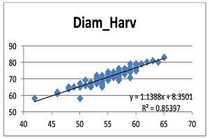
At the bottom of the format trend line box are three boxes. You can check the boxes for “display equation on chart” and “display R-squared value on chart”, then click close. The equation y=1.1388x + 8.3501 appears in the middle of the figure, but for easier reading it can be moved by dragging the box to a section of the plot with no symbols. Below is the figure that I produced. Diameter at harvest (diam2) is on the vertical axis and values range from 50 to 83 mm. The diameter at 60 DAB is on the horizontal axis and the range is 42 to 65 mm. The predicted line goes through the center of the cluster of points.
Interpreting the equation
It is obvious from this plot that there is some variation in the data and the relationship between fruit diameter at 60 DAB and fruit diameter at harvest seems linear. Notice that there were several apples that measured about 54mm at 60 DAB that ranged from 65 to 72cm at harvest. These were big apples because they were ‘Honeycrisp’ from lightly cropped trees. Obviously, all apples do not grow the same. The “y” value in the equation is the predicted value of fruit diameter at harvest. So in English, the equation means that diameter at harvest (mm) is equal to 1.139 times the diameter at 60 DAB plus 8.35mm.
The equation can be used to predict apple fruit diameter at harvest from measurements made at 60 DAB. The intercept is 8.3501 and this means that if an apple had a diameter of zero at 60 DAB, then that apple would have a diameter of 8.3501mm at harvest. Since it is impossible for an apple to have a diameter of zero, we can’t interpret the intercept literally. The slope of the line is 1.1388 and this means the diameter of an apple will increase 1.1388mm for every one mm increase in fruit diameter at 60 DAB.
I hope to be able to use this formula next year to predict the diameter of apples at harvest. Suppose we want to predict the diameter of an apple at harvest when it has a diameter of 55mm at 60 DAB. Using the formula:
Fruit diameter at harvest = (1.139 x 55) + 8.35 = 62.645 + 8.35 = 70.99mm.
So we can expect that fruits with diameters of 55mm at 60 DAB will be about 80mm in diameter at harvest. Don’t try to use this equation next year because I need to repeat the experiment to verify that the slope is similar for the two years.
Interpreting the R2-value
The R2 is called the “coefficient of variation” and is a statistical measure of how close the data are to the fitted line. Another way to think of it is the proportion of the total in fruit diameter at harvest that is explained by the variation in fruit diameter at 60 DAB. R2 values can range from 0 to 1.0; where 0 indicates absolutely no relationship between the two variables and 1.0 means that there is a perfect relationship between the two variables. When R2 is zero, the scatter plot is a cloud of points with no noticeable pattern. When R2 is 1.0, all the points fall exactly on the predicted line. In this example the R2 value of 0.85 means that 85% of the variation in fruit diameter at harvest is explained by variation in fruit diameter 60 DAB. In physics or engineering, researchers often get R2 values of 0.9 or greater. There is a lot of variation in biological data and I rarely see R2 values greater than 0.8 and they are often 0.4 to 0.6, so the R2 value of 0.85 for this data set is pretty good. In general, I feel that if the model doesn’t explain at least half the variation (R2 = 0.5), then the predictive ability of the model isn’t very good.
A final word of caution!
It is important to avoid extrapolating beyond your data. In the above example, the largest fruit had a diameter of 65mm at 60 DAB. Since we have no observations of fruit larger than 65mm, we don’t know if the relationship will be the same for larger fruit. It is possible that large fruit might grow at a faster rate or a smaller rate than fruit with diameters of 42 to 65mm.
You can change the range of the values on the axes by right-clicking on one of the numbers on the axis and from the drop down menu choose “format axis.” At the top of the drop down menu click on buttons labeled “fixed” for the minimum and maximum values to adjust the range appropriately. Next click on one of the points in the plot and click on the right side of the mouse. In the drop down menu click on “add trend line.” The new menu will show different types of lines that can be fit to the data. The second option in the list is for a linear trend. In this case, I thought the linear fit would be appropriate.
At the bottom of the format trend line box are three boxes. You can check the boxes for “display equation on chart” and “display R-squared value on chart”, then click close. The equation y=1.1388x + 8.3501 appears in the middle of the figure, but for easier reading it can be moved by dragging the box to a section of the plot with no symbols. Below is the figure that I produced. Diameter at harvest (diam2) is on the vertical axis and values range from 50 to 83 mm. The diameter at 60 DAB is on the horizontal axis and the range is 42 to 65 mm. The predicted line goes through the center of the cluster of points.
Source: psu.edu