NEW TOOL FOR UNDERSTANDING RESEARCH
RESULTS FROM THE 2016 and 2017 growing seasons in the Precision Agriculture Advancement for Ontario project can now be found through an interactive story map available online at http://bit.ly/2wIVgGq.
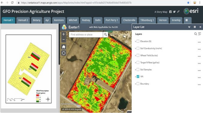
The story map can show multiple layers of data for each field, including elevation, soil conductivity, yield, target N rate, soil sample, and yield potential index (YPI). In the left margin is a quick summary of the most recent case study for each field and a quick look at the prescription map in that year. Full case study links (PDF) for either 2016 or 2017 can be found at the bottom of the summary.
This map is a good learning tool for anyone interested in learning more about how precision agriculture data can be interpreted and use to inform crop management decisions.
BASIS FOR PRESCRIPTION MAPS
The YPI was the foundation of any prescription making process in the project. In a limited three growing season project, the project team had to start somewhere and keep a consistent approach across years. This became an important factor in the resulting statistical analysis. A YPI takes yield data and normalizes it across years by defining grids that are above or below the average yield for the field within each year, so that you can better define the spatial consistency of the performance-based management zones across the field.
Yield maps don’t explain WHY the zone is poor performing, therefore in this project many other soil-landscape layers were collected as well. Yield data (especially older yield data) can be quite flawed and inaccurate so our collaborators at Niagara College developed some very rigorous cleaning tools for any precision agriculture dataset (Niagara Research Crop Portal: https://cropportal.ncinnovation.ca#). Niagara also programmed in some very advanced topographic elevation data modelling tools to create landform classes (e.g. foot, shoulder and side slopes). A multi-layer analysis (e.g. soil sensing + yield + soil chemistry / texture + topography) requires more research to create stable reliable management zones. Since 2016, a couple of the academic partners on this project have made more headway in this mathematical approach (McGill University: https://www.ispag.org/proceedings/?action=download&item=5290).
EXPERIMENTAL DESIGN ON EACH FIELD
In consultation with industry partners, it was proposed that the project should also explore the best method to automate and implement rates that would validate the rate chosen for each management zone (e.g. what rate was best for seed or fertilizer in each zone). Statistical analysis of 2016 data on all crop types indicates that longer sets of mini-strips (non-field length) for each set of treatments (seeding rates, nitrogen rates etc.) strategically place to cross all three management zones has more flexibility with respect to statistics and allows for better comparison to other data layers to draw crop response relationships (e.g. yield to electrical conductivity, or topography or soil chemistry or a combination of a few etc.). To ensure statistical validity, University of Guelph researchers suggest that assigning different preconceived rates to each base management zone (e.g. growers’ normal practice as medium zone, then plus and minus 20-25% for high vs. low zone) creates a bias in the dataset, and can limit inferences if preconceived ranges are incorrect. The suggestion was to choose three well spread out rates and replicate the same three rates in each management zone as the validation approach. Using this going forward is a best practice that will help ensure a repeatable statistical approach.
Over the life of the project, there was some difficulty in getting consistent replication on each field for the validation process (three per zone). Efforts were made to fit them in when geometry of the zones allowed — we still have the results published on those fields, but with less confidence that the research team could repeat the same results under the same growing conditions (this is noted on each field in the full and partial case study notes embedded in the story map).
LESSONS LEARNED
During the 2016 season, the statistical analysis determined that not all three zones performed differently, some YPI zones grouped in fields. For example, low and medium yield response zones were similar, but high yield response zones were different. Sometimes it was difficult to convince our industry partners to place large variations in rates that were replicated mainly because the rates seem agronomically ridiculous! Larger more exaggerated seeding or fertilizer rates is necessary to have a well characterized response curve. For 2016, the team used 5,000 corn seeds/acre apart per zone at a minimum. For soybeans, the rates were not low enough, therefore going into 2017 the goal was to aim for a larger spread (e.g. 80,000 vs. 140,000 vs. 200,000 seeds/acre). A key part of this partner project was working with our crop consultants across Ontario to be able to implement the variable rate strategies through that trusted relationship and then in turn help get the adoption of the validation approaches (i.e. full-length check strips, mini-strips, or learning stamps). Common factors that lead to success were fields with good historical data for a single crop type. These fields had more stable reliable management zones. Fields that were newer and had less years of data need more examination and perhaps the addition of other data layers to see how stability in defining the management zones could be improved.
How to use the GFO – PAAO Precision Ag Project Story Map